


Black & Bronze Ceramic Sink Set: Layout, Care, Style
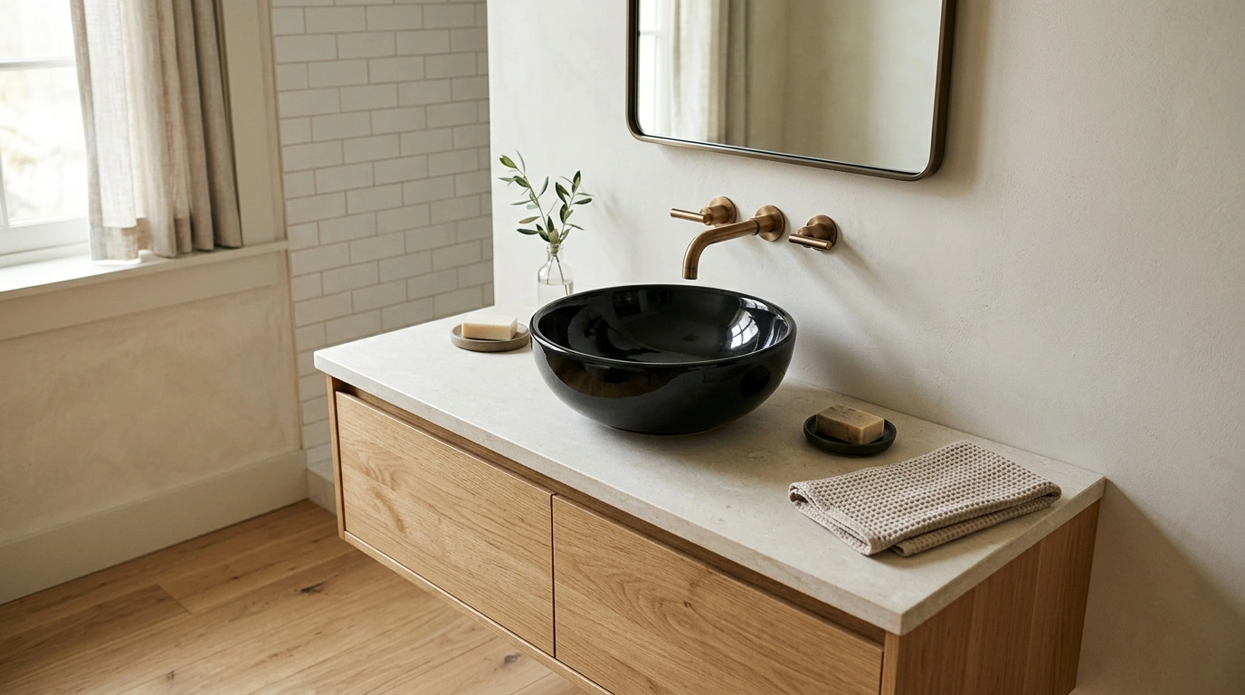
Deluxe Black and Bronze Ceramic Bathroom Sink Set: A Boutique-Hotel Statement for Everyday Living
A bathroom can feel finished—or feel forgettable. Our Deluxe Black and Bronze Ceramic Bathroom Sink Set is designed for the rooms where details matter: bold contrast, warm metallic accents, and a clean ceramic surface that reads polished from every angle. Below, our team lays out how to present the set as a centerpiece, how it fits into real bathroom layouts, and what to confirm before installation so the look stays intentional.
The look: black ceramic with bronze warmth
Black ceramic brings instant contrast—especially against light walls, pale stone, and natural wood vanities—while bronze adds a tailored warmth that keeps the palette dramatic without feeling cold. It’s a “curated” combination: classic enough to live with for years, but statement-ready in a way that makes even a simple bathroom feel designed.
This sink set shines in powder rooms (where impact matters most per square foot), guest baths (where you want a boutique-hotel welcome), and primary baths that already use layered lighting and thoughtful mirror framing. If your room is mostly quiet—clean paint, minimal décor, straightforward tile—black and bronze becomes the focal point that makes everything else look more deliberate.
What this sink set solves in a finished bathroom
Many bathrooms look “almost there” because the sink area feels pieced together: one finish on the faucet, another on the mirror, and a vanity top that doesn’t relate to either. A coordinated sink set creates a single, composed moment so the entire zone reads intentional.
It also adds visual weight to minimalist bathrooms that need a center of gravity. If the rest of the room is understated—simple tile, limited accessories, clean lines—this is the anchor that balances the space. And for refresh projects, upgrading one zone (the vanity + sink area) can shift the whole room’s mood without taking the renovation all the way down to studs.
Where the black + bronze palette fits best
| Bathroom direction | Wall & surface pairings | Hardware & décor notes |
|---|---|---|
| Modern minimal | White walls, pale stone, microcement | Use slim-framed mirrors; keep accessories matte and simple |
| Warm contemporary | Oak or walnut vanity, creamy tile | Repeat bronze tones in mirror frame or lighting for cohesion |
| Classic revival | Marble-look tile, wainscoting, soft neutrals | Add a small picture light or sconce to lean into heritage style |
| Moody spa | Charcoal tile, deep green paint, textured plaster | Layer lighting; add a soft runner to keep the space inviting |
Planning the vanity zone: sizing, clearances, and daily comfort
Before you commit to a statement sink, measure the entire sink zone—not just the vanity width. Capture vanity width and depth, backsplash height (or the height where tile begins), mirror width, and the side clearances to walls or tall cabinets. Those numbers determine whether the finished installation feels balanced or cramped.
Next, do the daily-use comfort checks. You want faucet reach that places water where hands naturally land, splash control that protects nearby surfaces, and enough countertop “landing space” for the things you actually use: soap, a small tray, skincare, or a toothbrush cup. Plan storage at the same time—drawers, pull-out organizers, and a spot for backup items—so the countertop can stay calm.
Finally, confirm flow. Check door swing, towel bar placement, and walkway clearance so the room feels open. If the vanity sits near a toilet or shower entry, even small shifts in spacing can make the room feel more generous.
For a helpful baseline on bathroom clearances and planning, we like the National Kitchen & Bath Association guidelines: https://nkba.org/.
Material story: ceramic surfaces that stay crisp
Ceramic is a clean-lined bathroom choice: smooth, polished, and easy to keep looking sharp with gentle day-to-day care. The goal is to let that crisp surface do the work—then style around it with restraint. Think soft textiles, a warm-toned tray, and one simple vase or stem, rather than multiple containers fighting for attention.
To preserve the finish, keep a few practical habits: wipe after heavy use (especially around standing water areas), avoid abrasive scrubbers, and choose non-acidic cleaners when possible. These small routines help the black surface stay rich and the overall sink zone look freshly detailed.
Installation readiness: what to confirm before ordering
If you’re also thinking about water efficiency while you update fixtures, the EPA’s WaterSense program is a solid reference point: https://www.epa.gov/watersense.
Care and styling routines that keep it looking elevated
Pairing suggestions from our collection
If you’re building a true statement moment, pair one statement sink zone with one statement light—often that’s the perfect high-end balance. Our Luxury Gold Crystal Branch Chandelier – Modern Ceiling Pendant Lighting is a strong option when you want the room to feel intentionally upgraded, not just updated.
FAQ
Does black ceramic show water spots easily?
Darker finishes can show mineral deposits more than white, especially in areas with hard water. A quick wipe after heavy use and a soft cloth with a mild cleaner keeps the surface looking crisp. If your water is very hard, reducing mineral buildup (or adding a softener) can make upkeep noticeably easier.
What countertop and vanity colors work best with black and bronze?
Warm woods like oak or walnut, creamy whites, beige stone, and marble-look surfaces all pair well with black and bronze. Keep metal finishes from multiplying—repeating bronze in one additional element (like a mirror frame or light fixture) usually creates the most intentional result.
What should be measured before installing a new sink set?
Measure vanity width and depth, the planned sink placement, faucet reach, backsplash height, mirror width, and sconce spacing if you’re adding lighting. Also confirm plumbing rough-in locations and check door swing plus towel bar clearances so the room functions comfortably once everything is installed.
Recommended for you



Costco Touchless Trash Cans: Types, Sizes, Features
Oct 13, 2026













Leave a comment